Ally Translation App
Role: UI/UX Designer | Research, Design Iteration, Wireframing, Prototyping | Tools: Figma About
Ally (stylized ally) is a healthcare language app designed to ease communication between two participants, usually the healthcare provider and patient, who are unable to talk to each other due to the language barrier. It allows the user to choose between a speech to text function or simple phrases to talk about health concerns and other topics necessary in a healthcare setting.
Problem
For immigrants and those who cannot communicate well in another language, understanding healthcare can be one of the biggest obstacles in getting help for any ailments or underlying health issues. While there are translators and software available to ease the problem, they can be costly and unavailable at every healthcare location, especially when traveling abroad. This was also inspired by my mom's personal struggles with communication, since her English is still broken, and I spent a good part of my childhood translating and trying to help out wherever I can to explain her health problems to the healthcare provider.
Solution
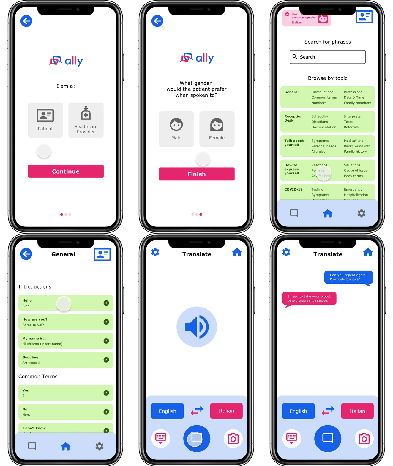
To address the problem, I envisioned an app that was friendly, approachable, and easy to use. I designed a mid-fidelity prototype that shows how the translations would work for both patients and healthcare providers, from onboarding to translations. Link to the Figma prototype can be found here.
User Research
When first researching other competitors in the field, I noticed that there were few that specifically catered to healthcare. As a result, there is a sizable gap in the market in terms of an app that could support users who couldn’t speak another language if they found themselves in an emergency health situation. After my own preliminary research, I focused on conducting interviews with my target audience of adults in their 50s-70s, or those who had limited knowledge of technology or language skills. While my interviews with the user group confirmed initial assumptions of communication frustrations and complicated explanations, it also revealed gaps in accessibility and confidence in using technology. Other pain points to consider included small buttons that are hard to press, complex UI, and no immediate translations or feedback.
Design Process
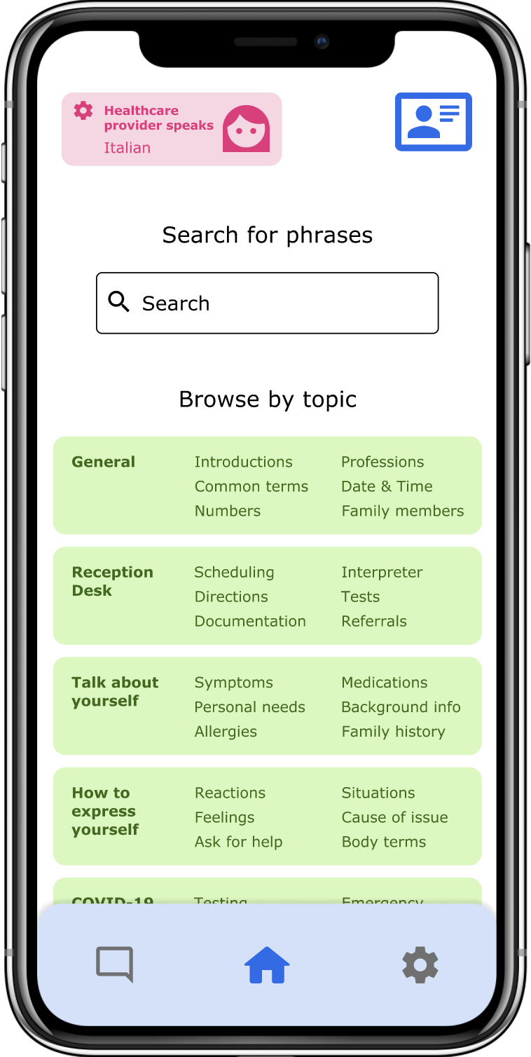
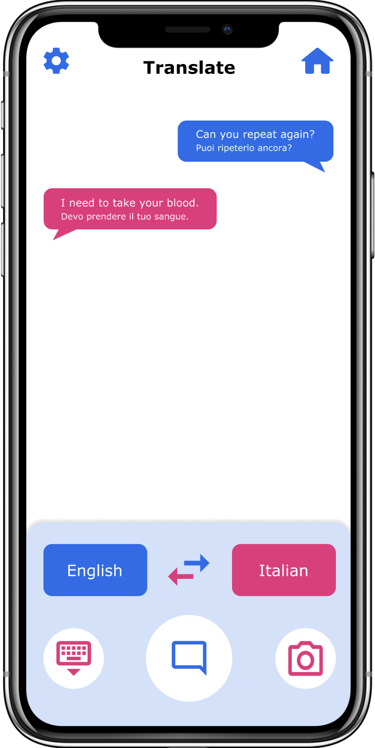
There are two main sections for translation, which are the topics page allowing for basic phrases, and a speech-to-translate function for faster communication. The type of topics for patients and healthcare providers also differ based on their understanding. For healthcare providers, their topics and phrases are geared towards their expertise, while patients can select topics that help them answer questions. Selecting a phrase allows for a vocal recording of the translation to sound out so both parties aren’t required to be fluent in speaking the language to communicate.
Initial paper wireframes
Patient vs. Healthcare Provider UI. Patients have a prominent blue/light blue theme while healthcare providers have a red/pink theme
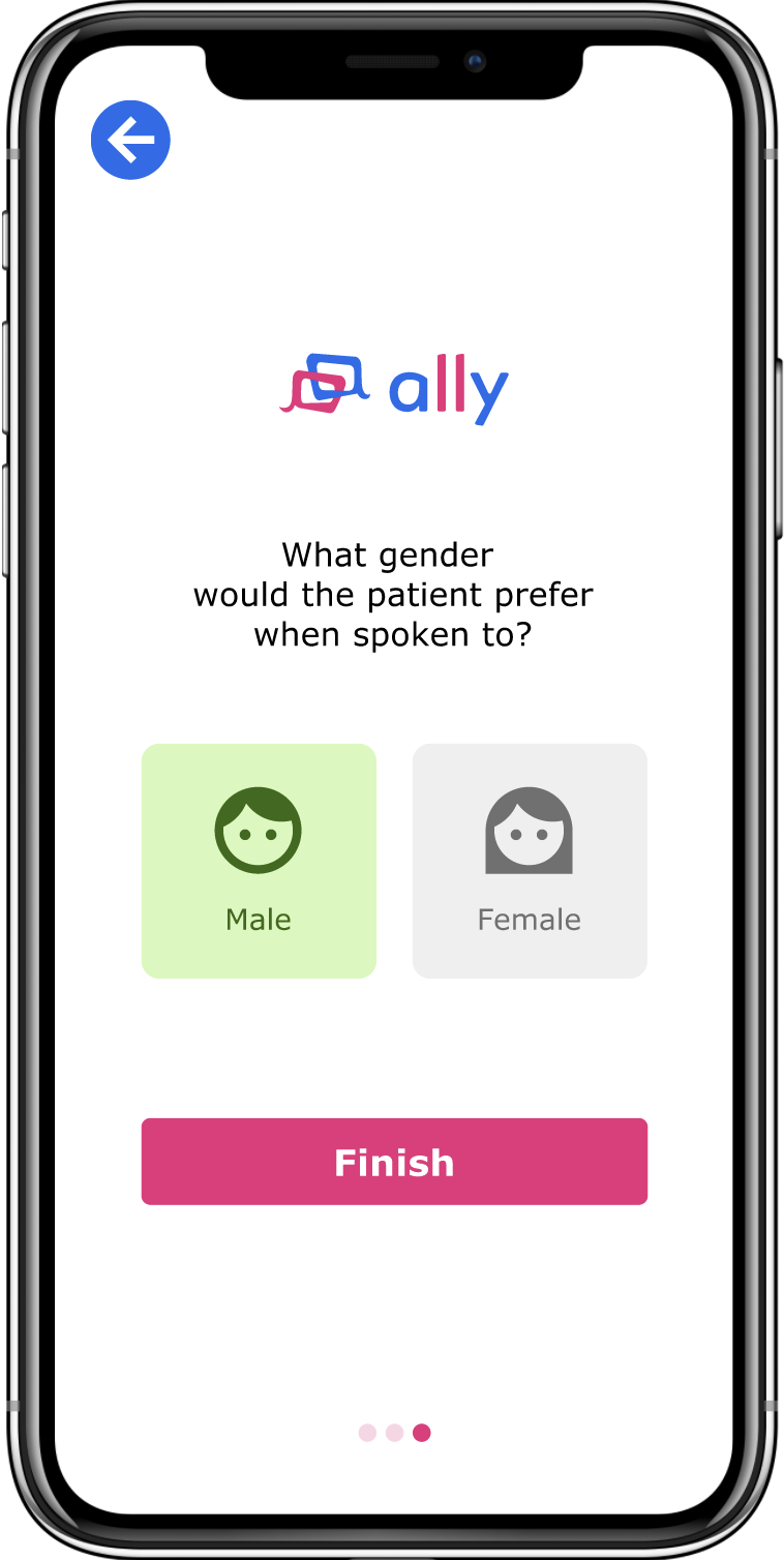
The design system was created with the intention of clarity and recognizable patterns. The two primary colors are used as a specific theme for patients and healthcare providers to make it easier to distinguish which type of user is using the app. The logo includes two interlocking speech bubbles to emphasize the need for both parties to reach an equal level of understanding.
Final Mock-Ups
Takeaways and Next Steps
Throughout the process, I learned that while the speech-to-translate function may not be feasible yet, it is still good to think big and consider how to tackle pain points from different directions. It also helped me understand how important information architecture is when organizing content, especially for a topic as complex as healthcare, which can cover a wide array of topics and situations.
Next steps are to test this with users to notice any pain points and to further refine the design elements to improve the UI/UX experience for users. I’d also look more into ways to make the app more accessible, considering features such as dark mode, font sizing, and adjusting the language to be more gender-neutral for those who don’t fall into the gender binary.


