OhSushi Menu and Ordering App
Role: UX Researcher & Designer | Research, Design Iteration, Wireframing, Prototyping, User Testing, Branding | Tools: FigmaProblem:
People are too busy with work and other obligations to make time for meal prep after hours.
Goal:
Design a sushi app that is easy to use and customizable for a variety of dietary reasons. The target audience is for busy adults in their 20s-40s who don’t have enough time in the day to cook for themselves.
Prototype for the final app design can be found here.
User Research
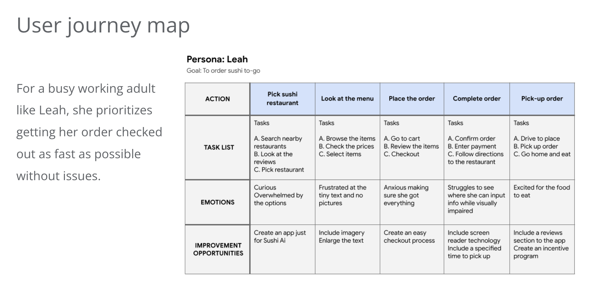
I began by conducting interviews with a variety of participants, primarily full-time working adults. While my interviews with the user group confirmed initial assumptions over why people would order meals-to-go, it also uncovered other factors, such as time spent on personal hobbies, accessibility issues, and work obligations that prevent them from cooking or eating out in-person. A common pain point brought up was the amount of text involved when ordering items. Especially for something like sushi, which can come in infinite combinations of ingredients, it can be difficult to know what is inside the food while also allowing for customization to allow for dietary reasons. The large number of ingredients to list out would be a challenge for mobile screens especially, due to the limited amount of screen space.
Design Iteration
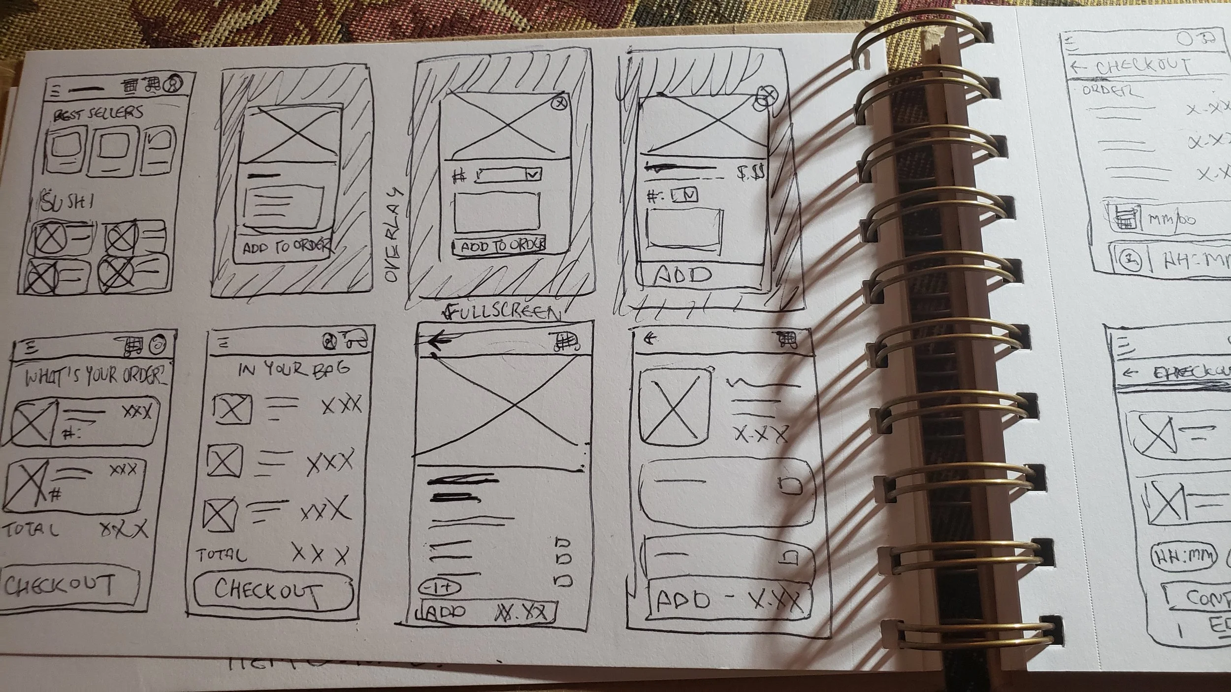
To begin the process, I drafted iterations of each screen of the app on paper that would address user pain points and to bring to life later into digital wireframes. Some things I considered were ease of checkout, strong use of imagery, and how to organize content through hierarchy. As I continued refining and moving into low-fidelity wireframing and prototyping, I would omit some features that were superfluous or unnecessary to the user flow, like the add button to best sellers.
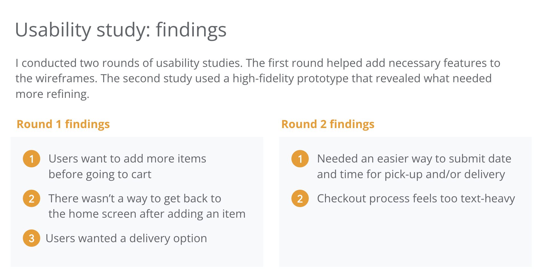
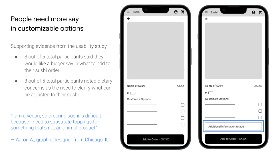
There was a need to include features to the app I did not consider after testing it with participants, such as adding a delivery option. In addition to the checkboxes to customize the item, there is an input field for users to type in exactly what restrictions they need. Features I had in mind in order to make the app more accessible included imagery with alt text and meeting WCAG AA color contrast standards.
Final Mock-Ups
Takeaways and Next Steps
Throughout the process of creating, I learned how important it was to have a solid foundation of research before working on designs. With a good amount of research, I was able to wireframe and prototype much more confidently as I iterated and updated my designs based on user feedback. This reminded me of an important quote a colleague said about this type of field:
“UX design is 90% planning and 10% actually designing visuals.”
Next steps to consider when refining this app further include doing additional user test to check for any pain points lingering and reviewing ways in which the app can be even more accessible to a variety of users.


