Scavenger Hunt
A Chrome extension used to collect brand elements from a client’s website that can be applied quickly across multiple onsite deployments and email.
Product Design

Project Overview
Client: Wunderkind
Industry: SaaS, Marketing, E-Commerce
Timeline: 8 weeks (May 2023 - July 2023)
My Role: Product Designer, UX Researcher
Background
Scavenger Hunt is a Chrome extension used internally inside Wunderkind to collect brand elements from client’s website. This is so we can upload it to a brand kit that can be applied quickly across multiple onsite deployments and email to cut down scope time.
Problem
At Wunderkind, when a designer first gets assigned a new client project, the first course of action is to scope the client’s site for branding elements.
A client’s website is scoped up to 3 or 4 times by several different teams. The Design Studio scopes it three times:
On Day 0, by a design manager (45mins)
When the project begins (40-60mins)
And once when the full suite begins. It’s ad hoc, looking for styling notes in particular such as animation interactions and input focus states. If a designer can’t replicate an animation or styling like gradients, they often have to rely on UX Engineers to help code it, which adds extra time to the scoping process.
How long does it take to put together a brand kit?
While we don’t have exact numbers on how long a brand style in particular takes, as a part of a full suite task, it averages out to 4 hours.
Goal
The objectives were clear:
Efficiency: Decrease scope time gathering assets into one package
Modern Visual Design: Make the platform visually competitive and appealing.
Easy User Experience: Simple but effective navigation, clarity, and ease of use to limit user frustrations and awkward workarounds.
Results
The Chrome extension significantly cut down time by addressing the key issues identified in user feedback. Users highlighted the ease of use and the instant readability of the elements needed for the brand kit. Additionally, the reception to the extension was so positive that Scavenger Hunt has increased dramatically in scope from being just a design scoping tool to gathering copy text and brand tone for copywriters, which is still being optimized and being implemented in later stages.
50%Reduced scoping time | 60%Less manual inputs in brand kit | 95%Approval rate by users |
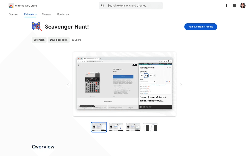
Chrome page
As a side note, I also designed the icon for the Chrome extension using WKND brand colors. This was inspired by everyone in the team being a cat person or owned a cat.
 |  |
Design Process
The project kicked off with a whiteboard session where we followed the general process of a client onboarding to Wunderkind for the first time. We also researched similar plug-ins and looked into the technical aspects of design elements onsite. Lastly, we discussed leveraging newer technologies such as AI or machine learning to help with gathering color styles or scoping out text. For the initial MVP, we wanted to have a working extension to scope onsite and save email for later.
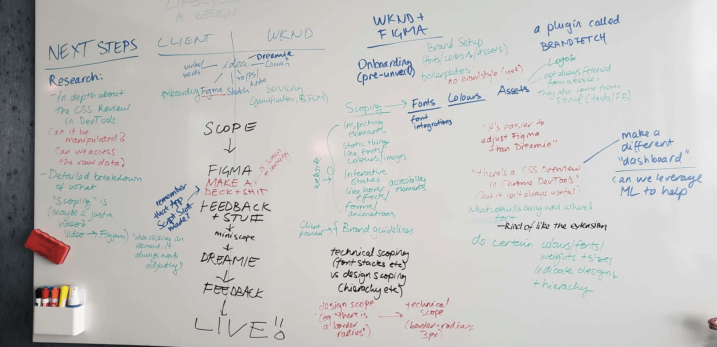
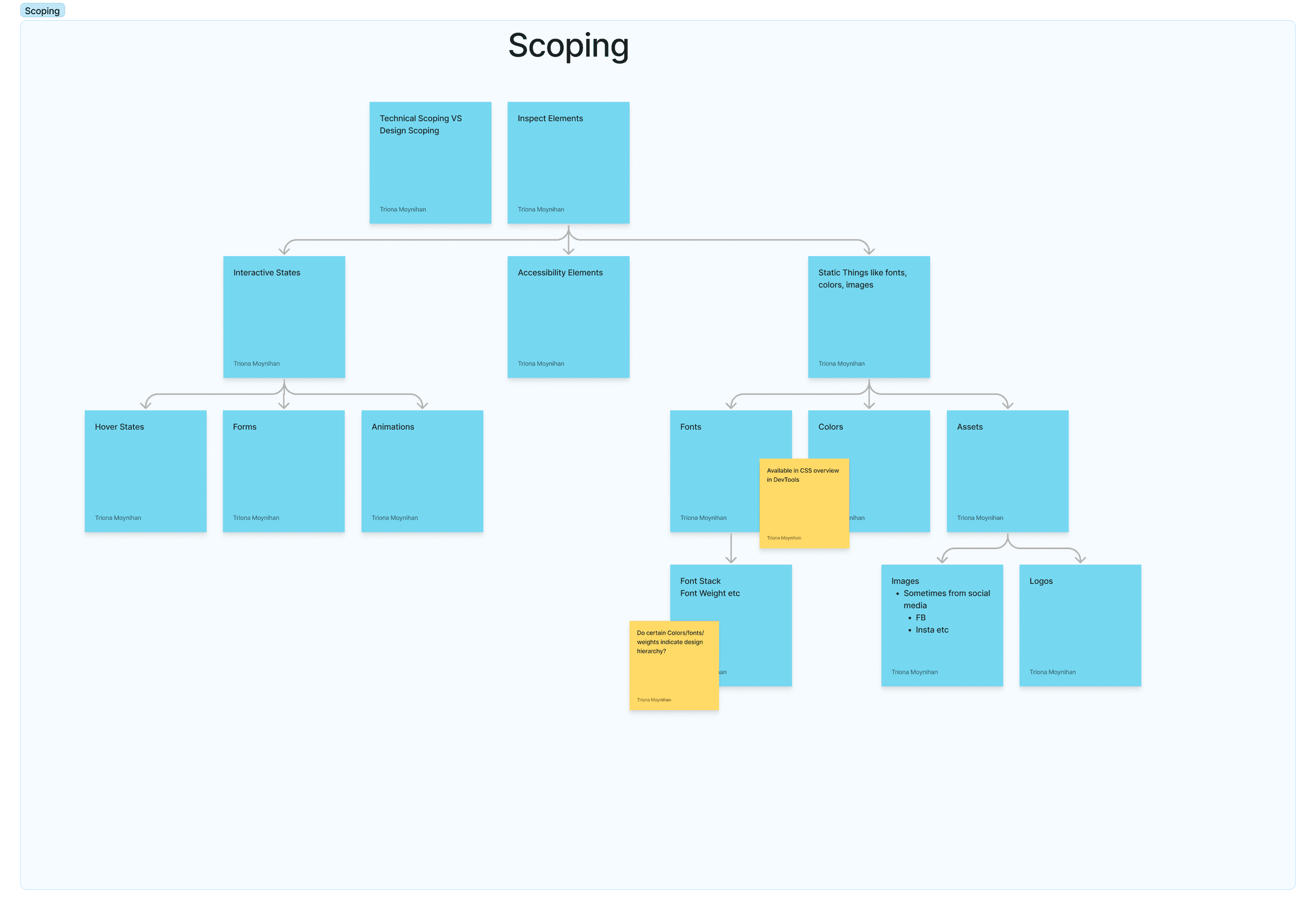
Here we laid out the general process of what it looks like scoping for a brand kit for the first time. While most elements can be gathered quickly through Chrome DevTools, technical features such animations and hover states take a bit more time to emulate.
Conducting Interviews
After whiteboarding, I conducted interviews with associate and senior designers on how they approach the scoping process. I did a series of five interviews discussing pain points, what features they would like to see in the extension, and how they pick which elements go into the brand kit. While each one differed in their scoping, they shared similar concerns with difficulty emulating animation styles, validation styles not easy to update, and conversions between px, em, and rem values. Although we decided to primarily focus on onsite for the MVP (minimum viable product), it was also important to consider how email could have its own frustrations different from onsite experiences.
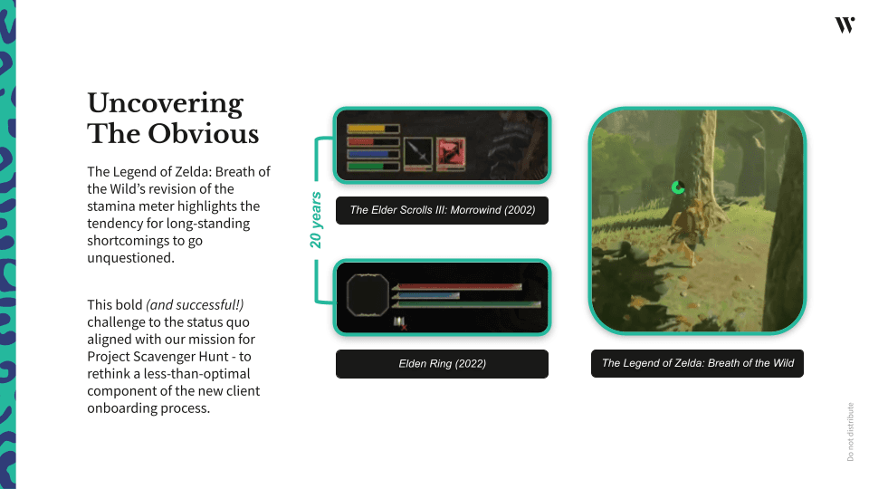
(ps how great is zelda)
What may seem like an out-of-place message in the design process was actually one of our biggest inspirations when coming up with the UI. When brainstorming ideas to separate the elements based on our research, we looked to sources outside of our industry for inspiration. During the time, The Legend of Zelda: Tears of the Kingdom had recently released, which me and a fellow UX engineer were obsessed with playing outside of work. The game’s main spirit of in-game searching and gathering impacted the design of how Scavenger Hunt would look and function. The inventory menu in particular had clever UI design that made it easy to separate the various items gamers gather in their adventure as they travel across Hyrule.
 | 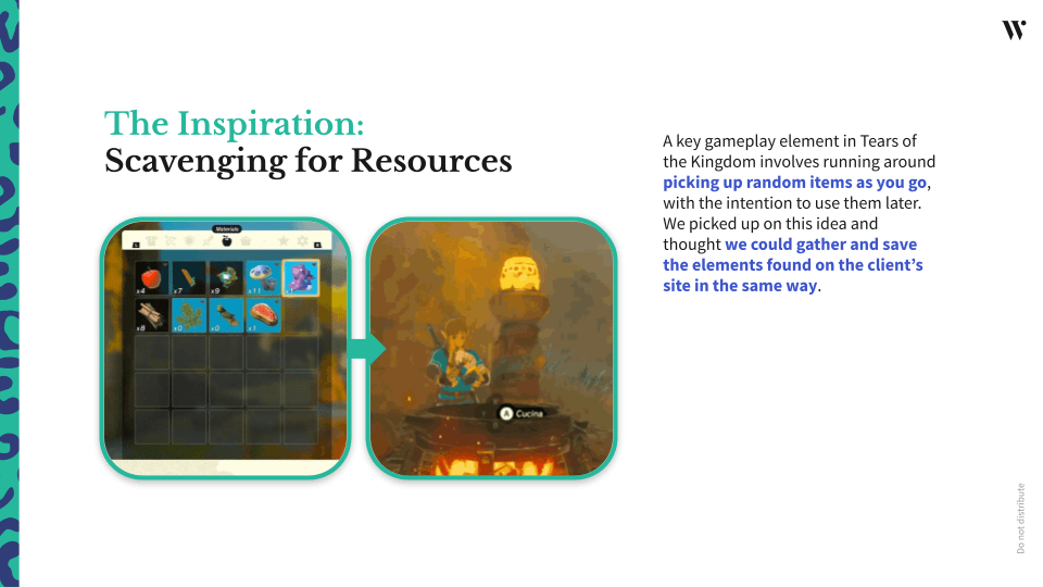 |
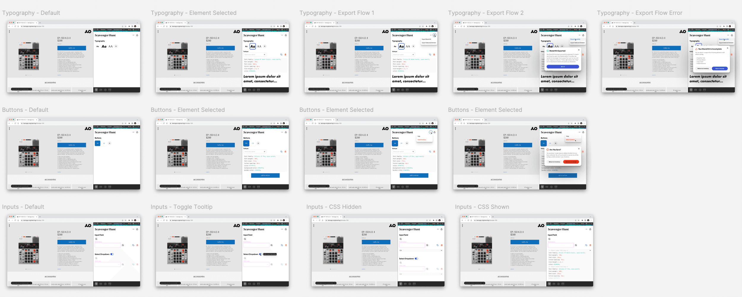
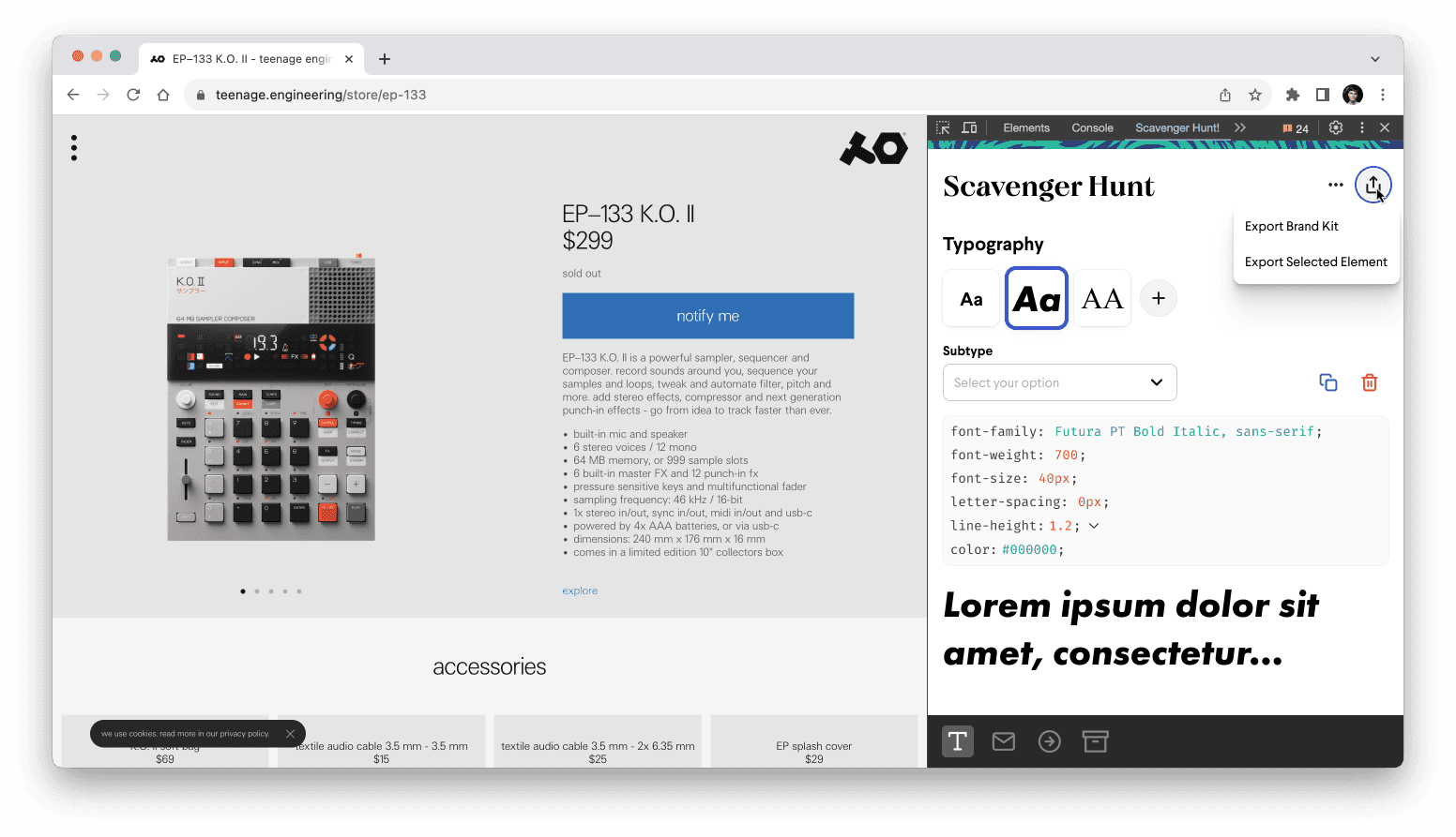
Using Zelda’s inventory UI as a key reference, I broke down how it would translate to gathering brand elements onsite. One of the defining features I set out was a navigation bar that broke down the elements into separate categories such as typography, buttons, input fields, etc. Other functions I discussed with the UX engineers included how would we notify users if they erroneously picked the wrong element to scope, how specific we could go in editing values, and how to display the elements gathered in a visually pleasing way. The use of squares revealing the content inside was a clever way to convey information easily while also allowing for secondary information to populate underneath for more context. This allows for visual consistency across all the different categories as users click into the navigation bar while scoping other elements.
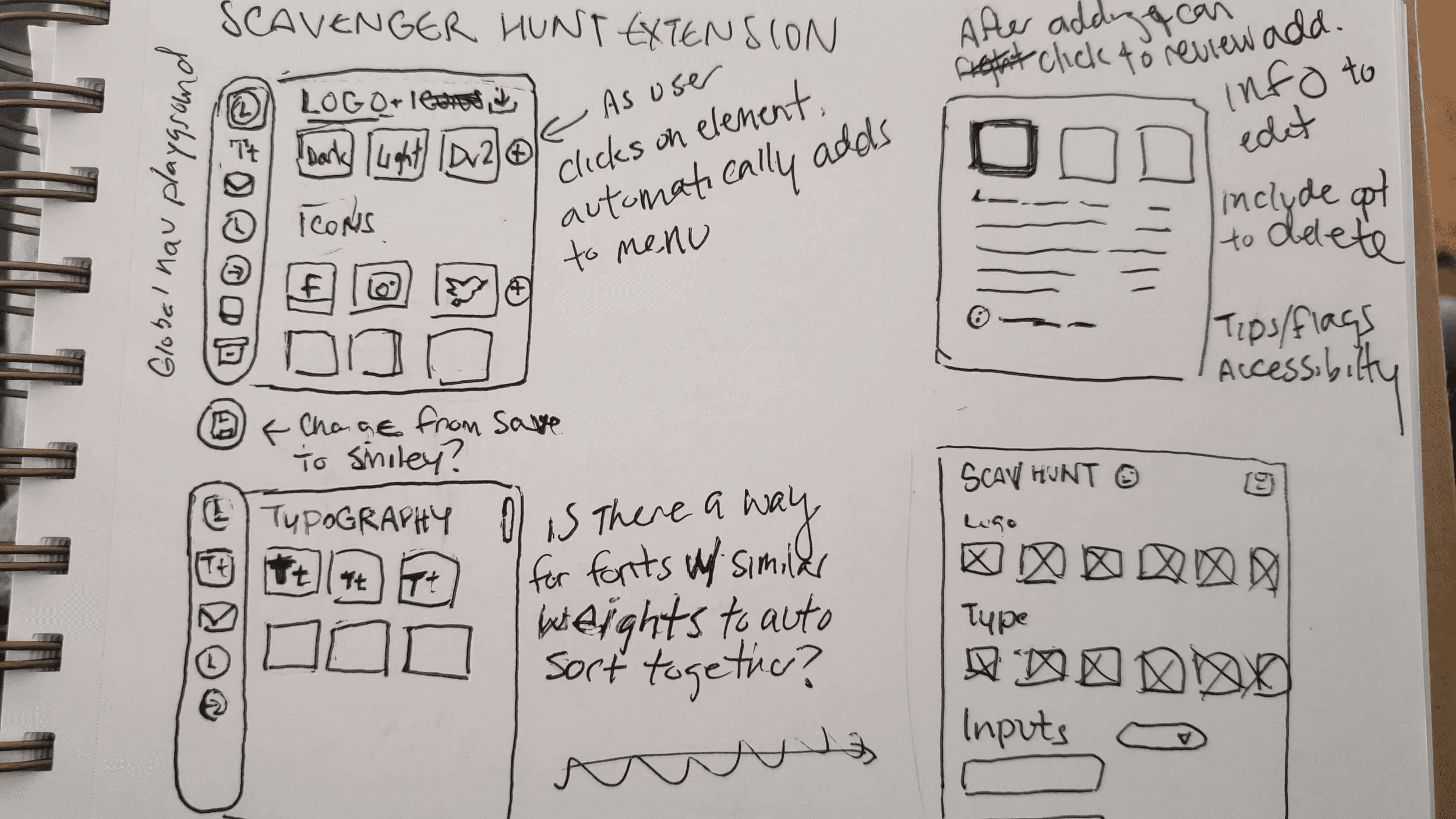
After iterating, I brought it into Figma for prototyping. One important development when I was sharing digital wireframes with the team was how typography would be displayed in a concise manner. Scoping for text is one of our biggest tasks that takes a lot of time do how they differ across buttons, type hierarchies, and more. There’s also the fact that type has many properties in it that we must consider, such as font size, line height, and letter spacing that makes it more complex than collecting hex codes for color. As a result, we included a text preview with placeholder text to make it easier to envision than just the square button.
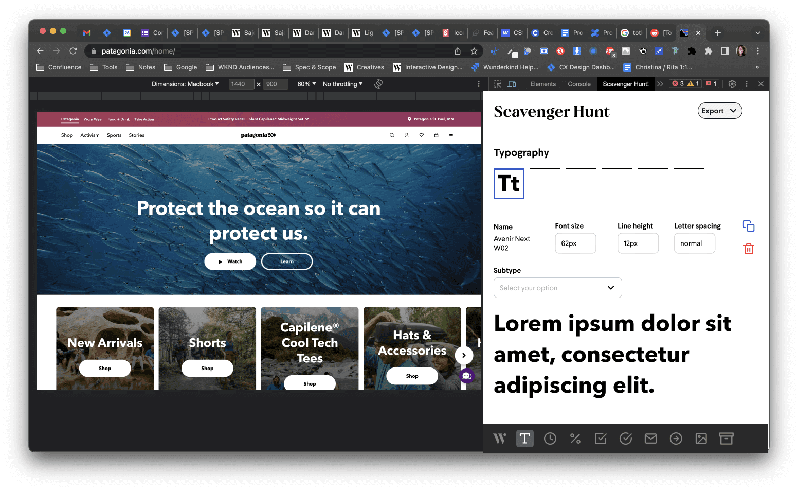
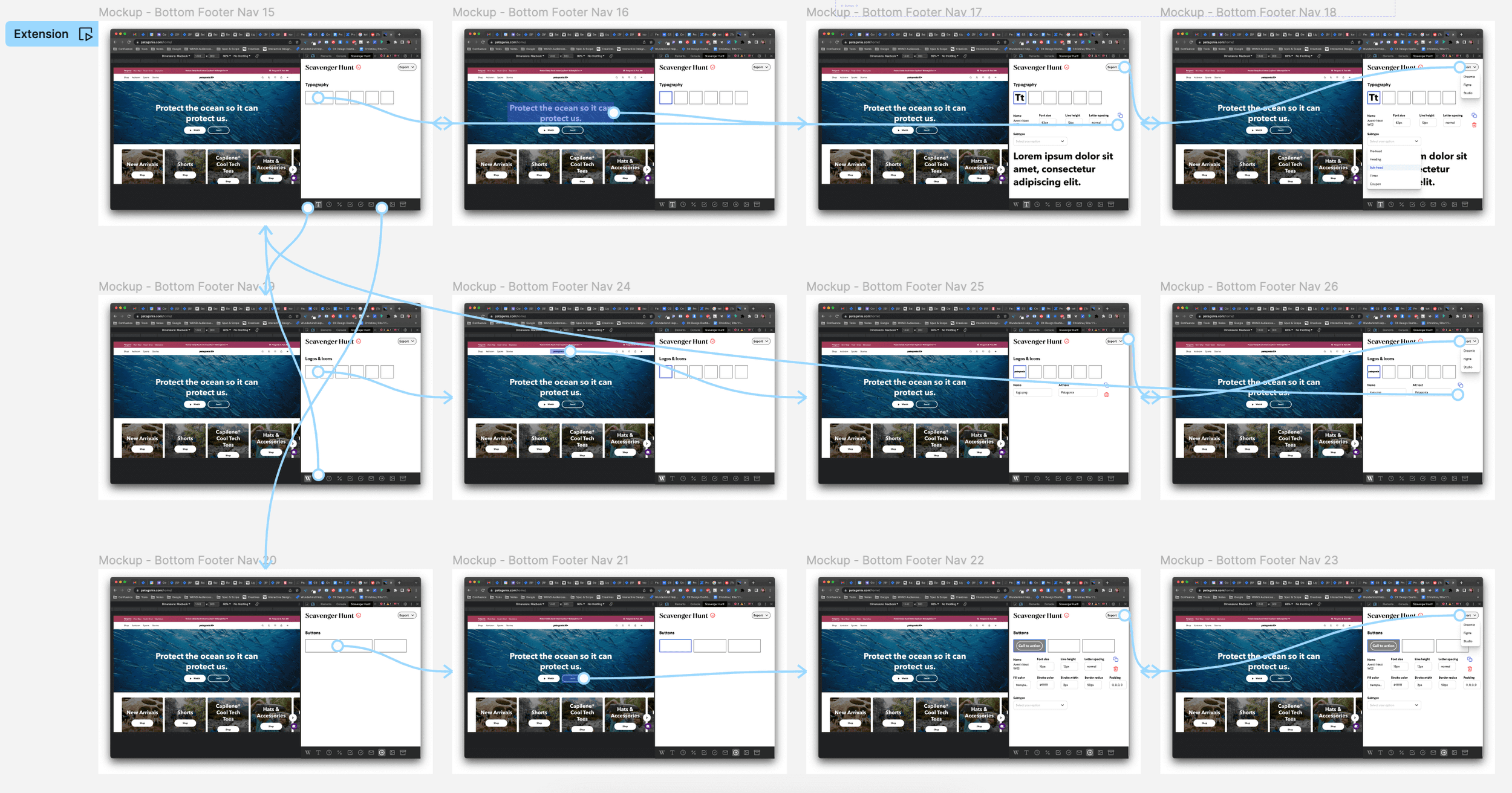
After prototyping and sharing my designs, the UXE engineers set to work coding while I focused on creating high-fidelity designs for the final look. Besides making the extension look polished and more in-brand, the team added tooltips, error flow messaging, and an export overlay for when the brand kit is ready to be exported to another software.
In usability tests, users expressed enthusiasm at the visuals provided for instant feedback on clicking elements onsite. More importantly, the ability to port all of the elements into one zip file to be populated in the brand kit allowed for more organized, instant data entry created instead of having to manually scrape the clients' site for assets and element details. This gave back time to the users that can be used for more important tasks in the onboarding process.
Reflections
Taking on the UI/UX design of the Chrome extension had me independently research contexts and requirements as the sole designer, learning lots in the process.
The biggest challenge was transforming a highly complex tesk designed into an efficient product while avoiding the risk of errors that could cost time for both users and clients.
This project underscored the importance of rigorous user research in validating user pain points, leading to successful user tests. Additionally, the improvements in communication across PMs, engineers, design, and QA in an agile setting ultimately led to Scavenger Hunts's success.